Aidat
Building dues, residents and notices — finally in one friendly place.
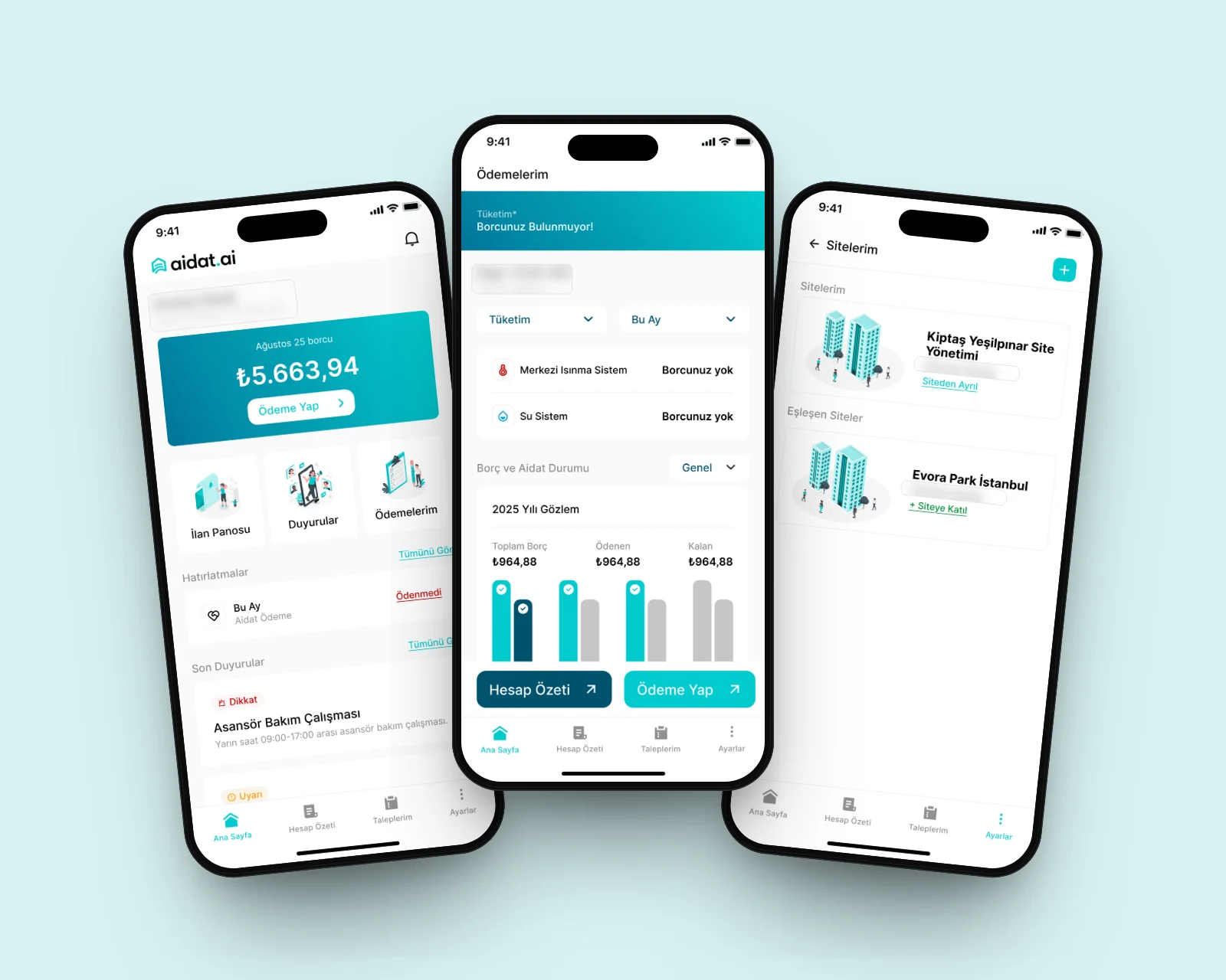
Apartment complexes were run on spreadsheets, paper notices and noisy group chats. Residents didn’t know what they owed or what was happening; managers spent their days answering the same questions.
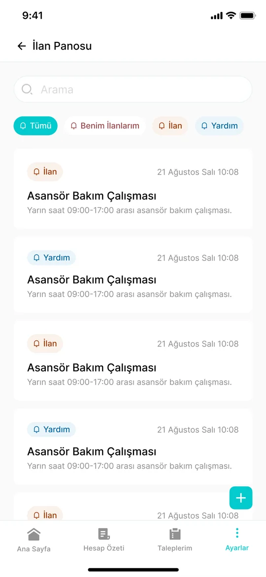
We designed aidat.ai around one home screen that answers both: what do I owe, and what’s going on in my building. Payments, account history and notices sit one tap away — with a tone that feels like a neighbour, not a bank.
We named the feeling,then drew the mark.
The Aidat logo, colour palette and visual language were designed by Studio Boldframe — so the brand and the product speak with one voice.
From the first questionto the shipped app.
One team owned Aidat from strategy and concept to the final interface — no hand‑offs in between.
Brand identity
The aidat.ai name treatment and mark — a house drawn from flowing lines — with a fresh teal that makes a dull topic feel lighter.
Strategy
Two sides of the same building: residents who want clarity, and managers who want fewer calls. Every feature had to help both.
Concept
A single home with dues, reminders and the latest notices, plus support for people who live in or manage more than one site.
UX & UI
Payments, account summary, notice board and settings — with friendly illustrations and clear money states: paid, due, overdue.
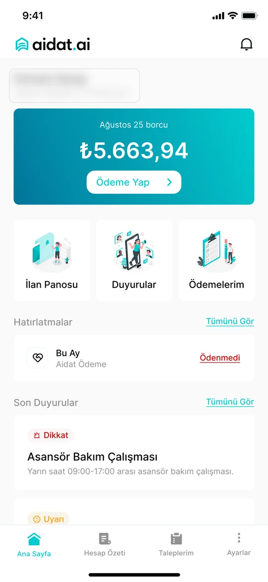
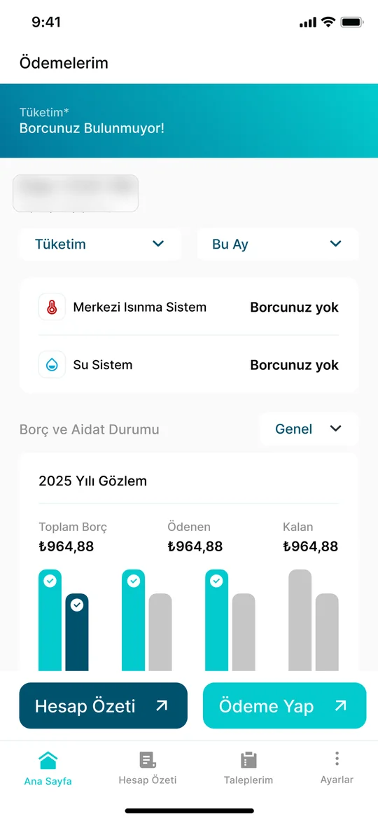
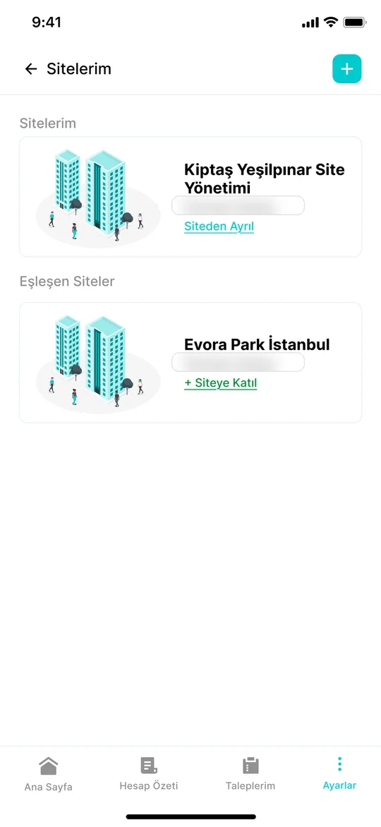
aidat.ai is live on the App Store and Google Play — one brand and one product, designed end to end.